Responsive Web App
MyCap College Shopping Platform
Year
2022
Client
College Aid Pro
Industry
Education
Type
Responsive Web
Role
Lead Product Designer
Project Length
3 Months
Challenge
College Aid Pro’s mission is focused on ending the student debt crisis. Most prominently known for providing software that helps financial advisors deliver college planning strategies to their clients, CAP envisioned a direct to customer platform. As a result, the ask focused on reimagining the existing B2B tool in order to directly empower students to plan, compare and access a college education without debt.
Solution
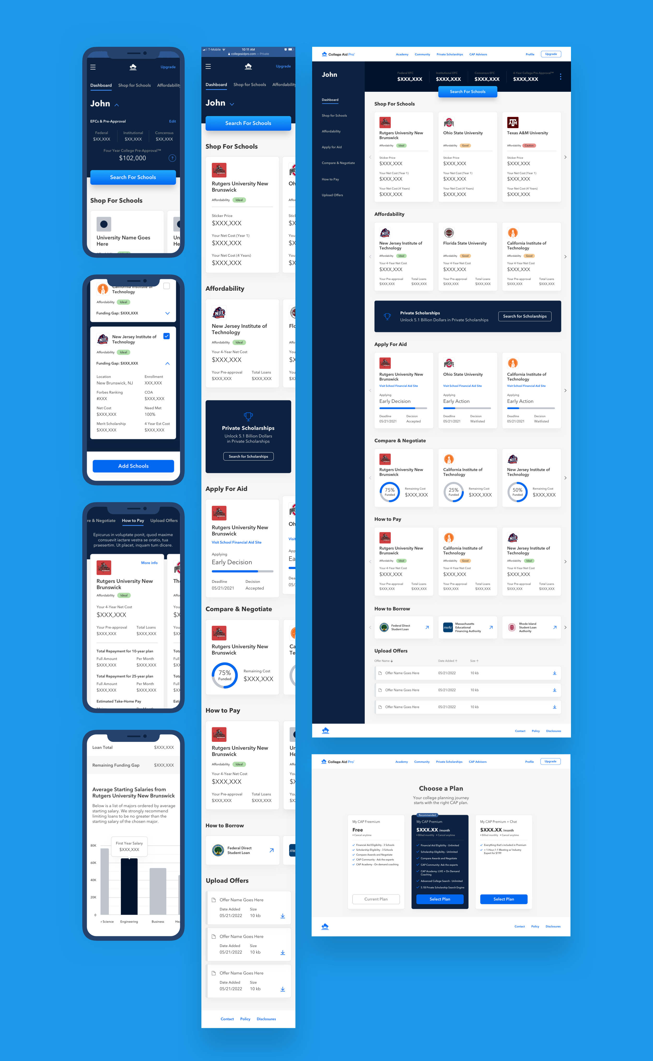
The MyCap tool helps student’s pay less for college by providing them with a plan as well as a robust set of tools that maximize the amount of money available for their education.
Key features of the platform include:
An Optimized Onboarding Flow that helps families get a realistic picture of their current college finances.
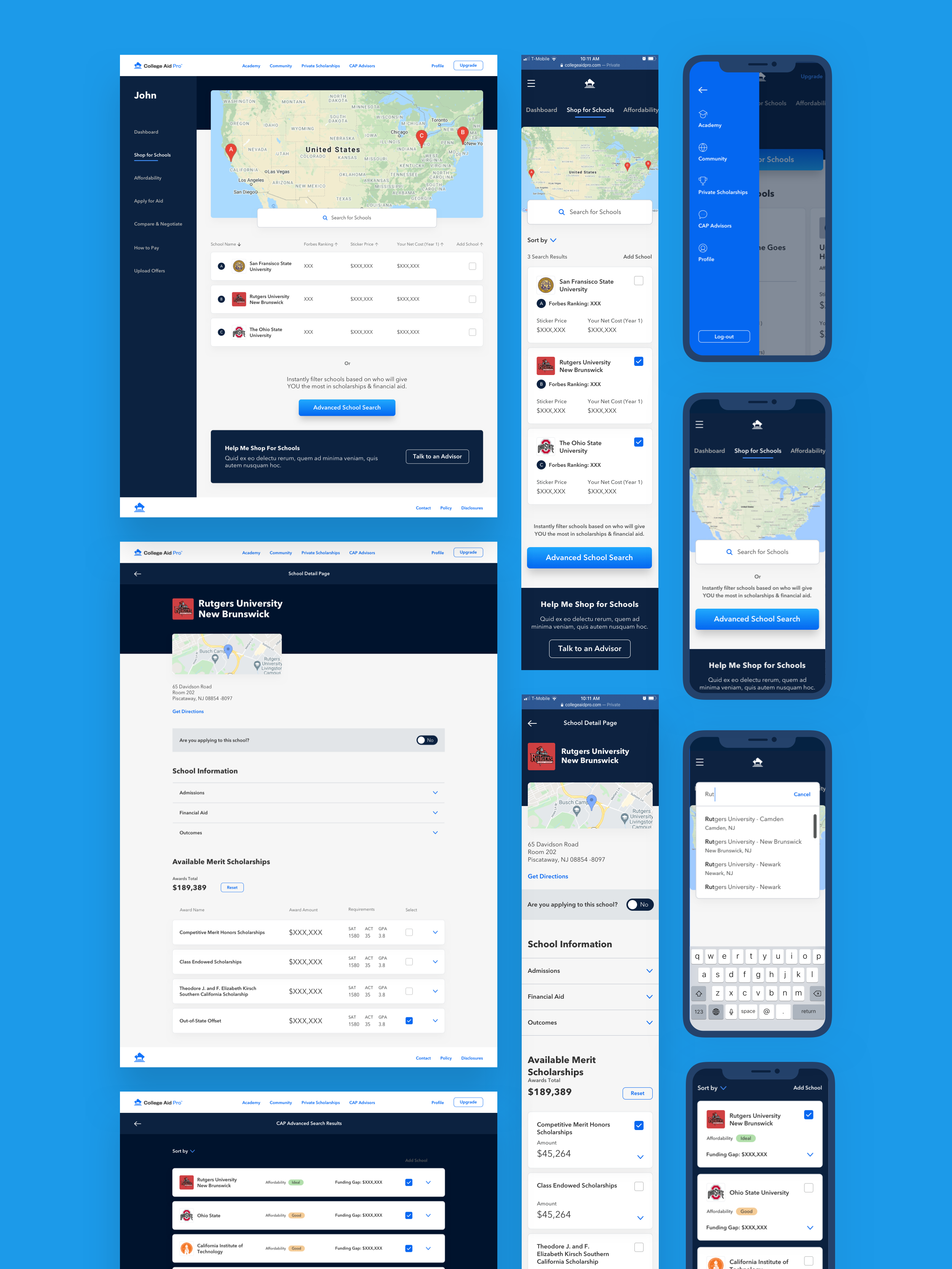
An Advanced Search feature that compares US colleges based on which offer the most financial aid and scholarships.
The ability to Create Your Own List of preferred schools, track their deadlines, admission requirements, application status, and more.
Impact
Visitors/month in Q1 2022: 1200+
Highest YTD weekly user count: 724
YTD page views: 3200+
Discovery & Definition
The project opened with a platform audit — a deep dive into the existing experience to understand what was working, what wasn't, and where the biggest opportunities lay. Armed with those findings, a co-creation workshop brought key stakeholders into the process, aligning the team around user needs, surfacing new requirements, and generating early-stage ideas. From there, the work moved into defining user flows and translating them into mid-fidelity wireframes, bridging discovery and design into a clear, actionable direction.
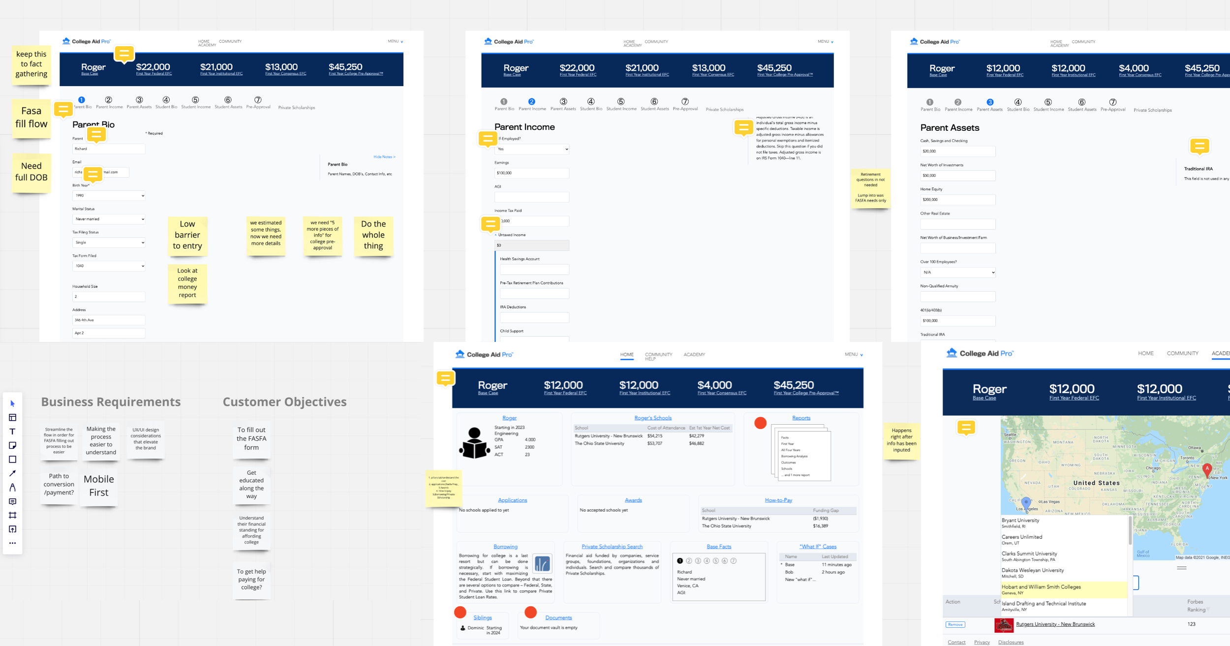
Existing Platform Audit
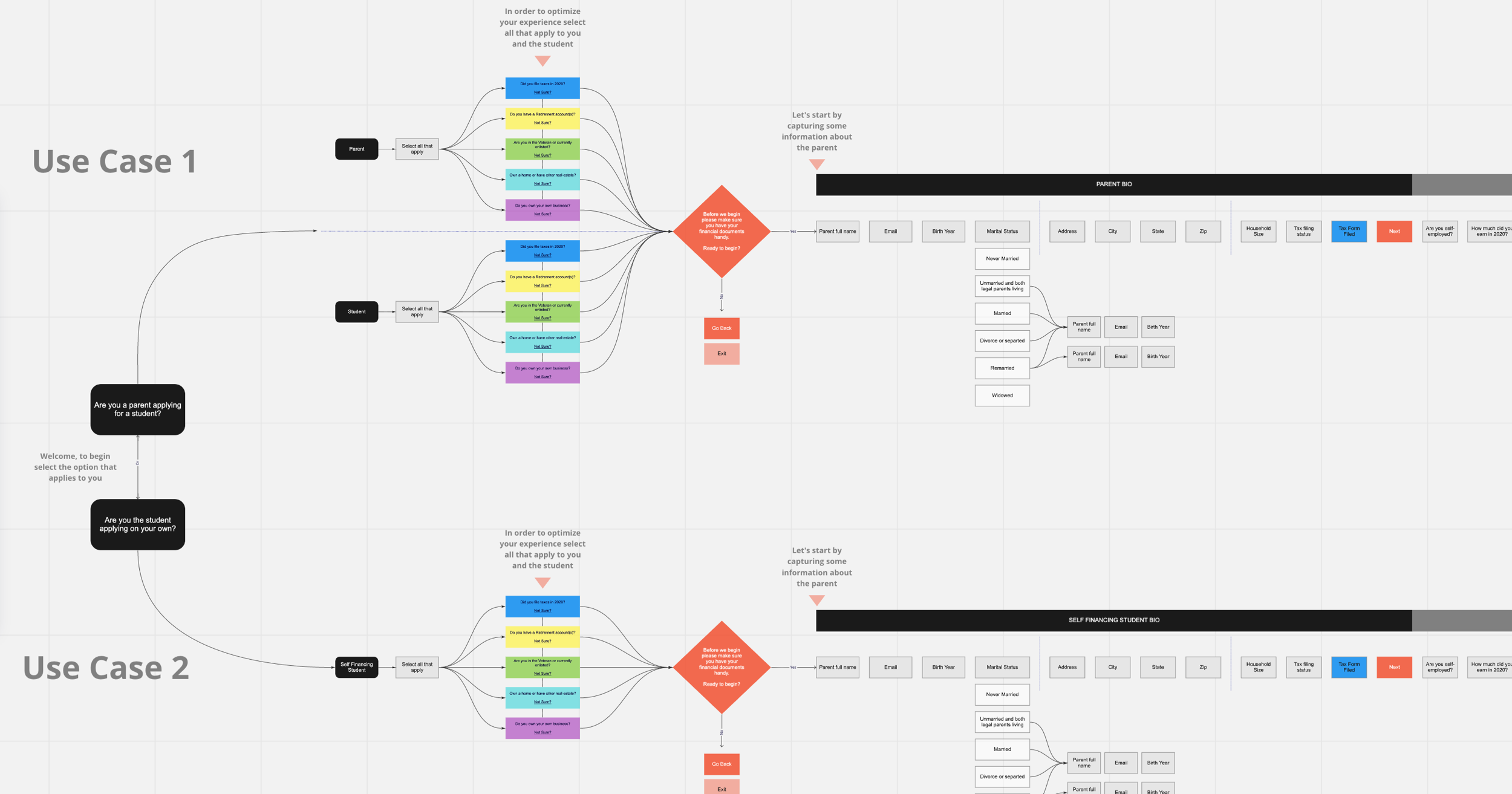
User Flows
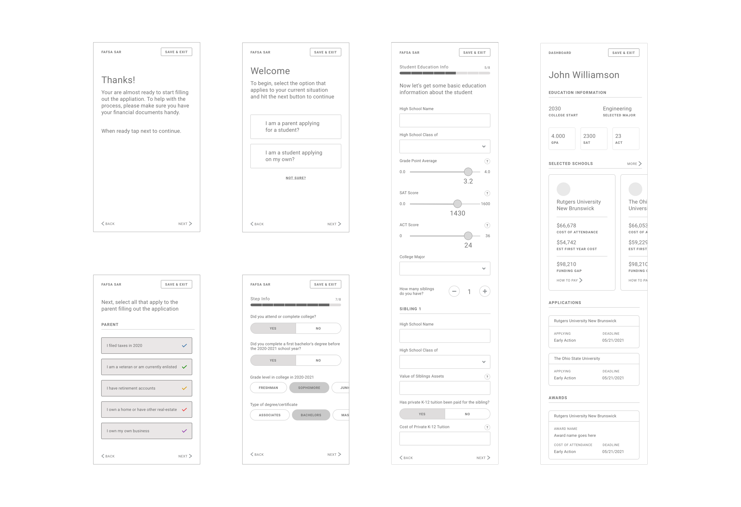
Mobile Wireframes
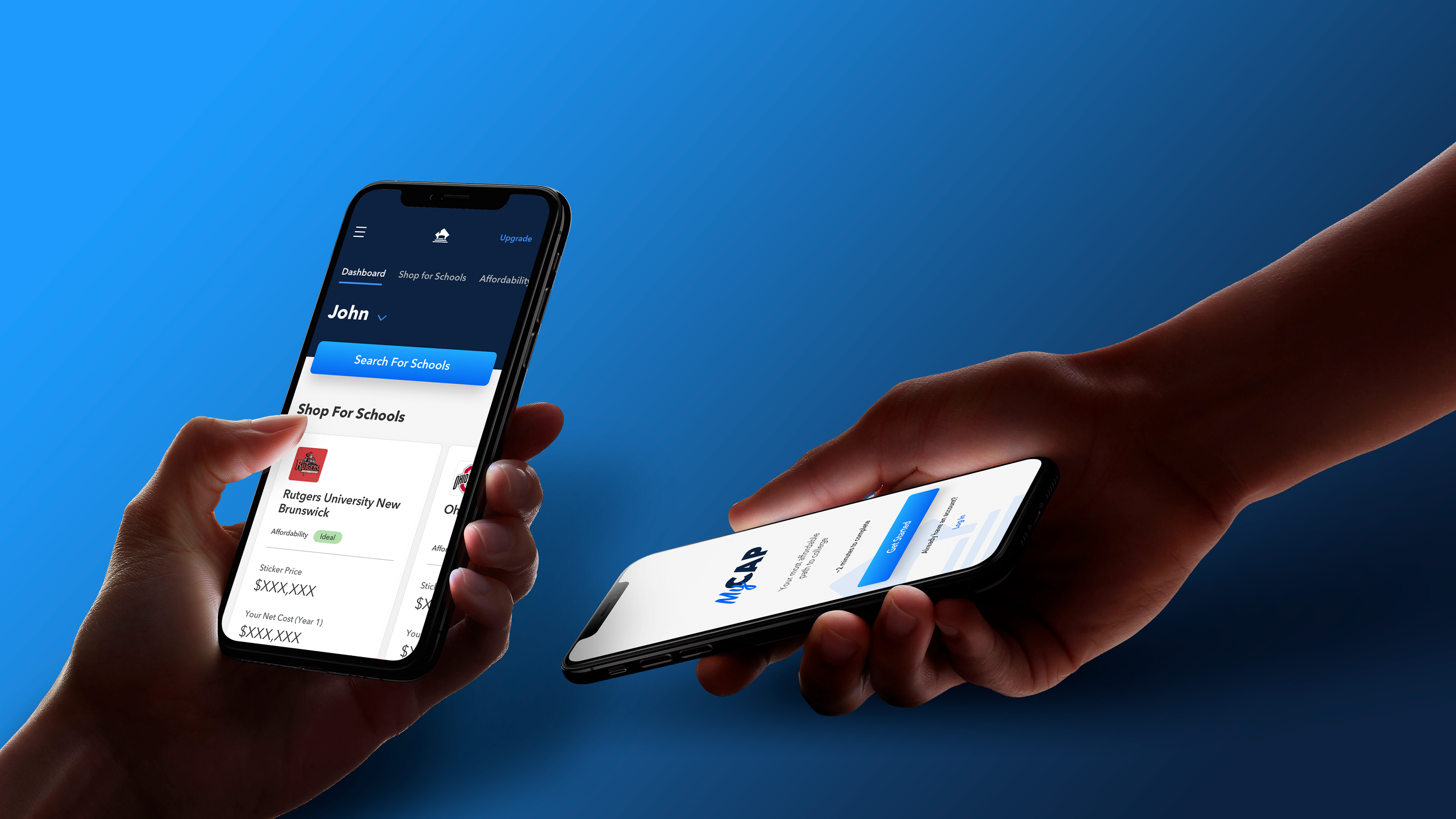
Mobile First Approach
On-Boarding Screens
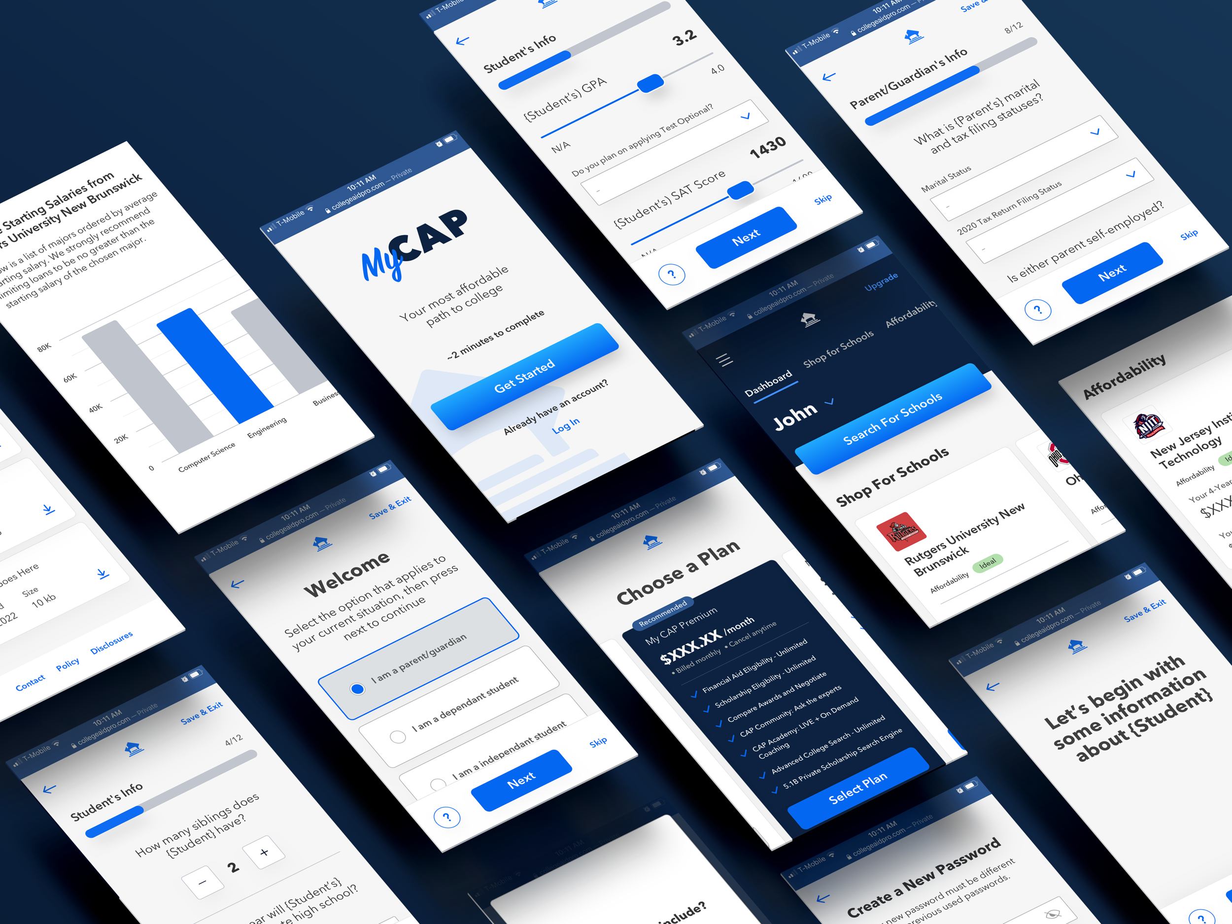
With a mobile-first lens guiding every decision, the design system and visual language took shape from the ground up. The onboarding flow was the first target — stripped back and restructured to reduce cognitive load and create an experience that felt immediate and intuitive. From there, the existing visual language was expanded into a cohesive system, and a modular school card was developed to bring real contextual intelligence to the interface, surfacing the right information at the right moment depending on where each school sits in a user's college shopping journey.
Agile communication was central to how the project ran. Continuous alignment between CAP stakeholders, project management, and developers meant that nothing got lost in translation, and the result was a clean design handoff and an MVP that launched on schedule.
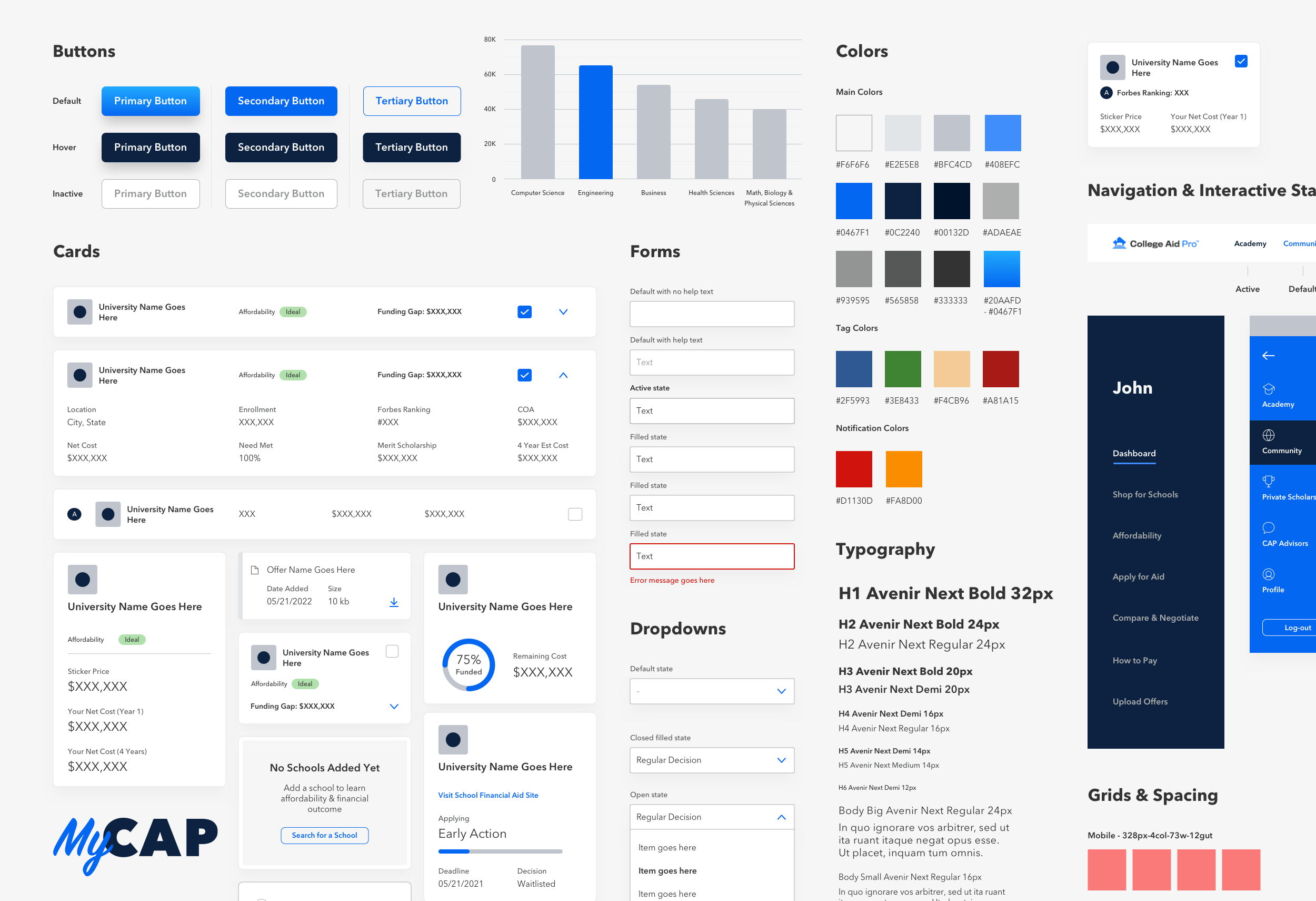
Component Library